The concept
To briefly explain the thinking behind this logo concept, I began by exploring more abstract ways of representing the key themes within your charity – community, the Earth, and charity. Through looking into more symbolic interpretations of these elements, I was able to combine them in a way that creates a more distinctive and personal logo mark.
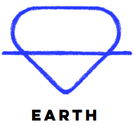
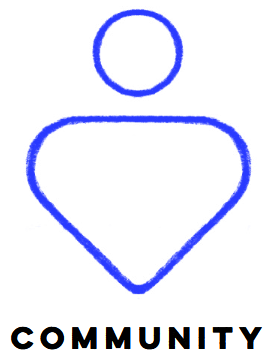
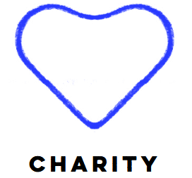
A logo that feels unique within the sector can be a valuable asset. By moving away from a globe-based depiction of the Earth, there’s an opportunity for the charity to stand apart in a way that feels both original and closely aligned with its purpose.

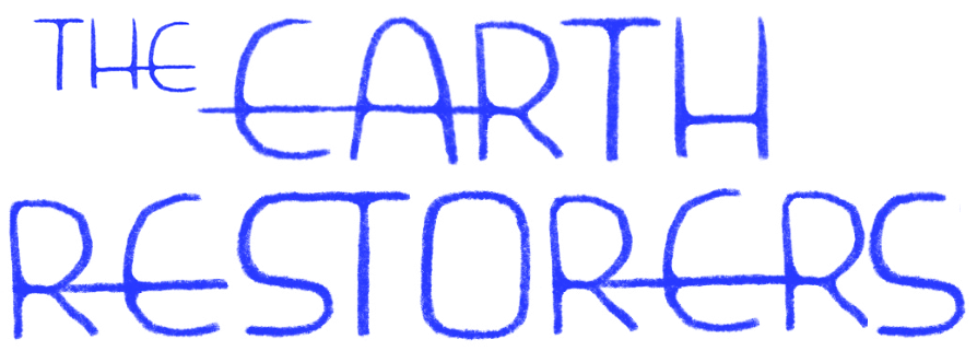
Wordmark
I’ve also developed an optional custom typeface to complement the logo, which could be used as a secondary logo or wordmark. This would allow for a consistent and recognisable way to present the charity’s name across a variety of contexts – such as social media, merchandise, or printed materials.
Introducing a custom typeface can add an extra layer of character to the brand, helping to build a more cohesive and memorable visual identity. As it’s still in the early stages, I’d be happy to continue refining it based on your preferences or how you might like to see it used.
Elinor
Elinor Bryan Design
https://www.instagram.com/elinorbryandesign/